

New identity
2022
Art direction & brand identity
Itraco
The project
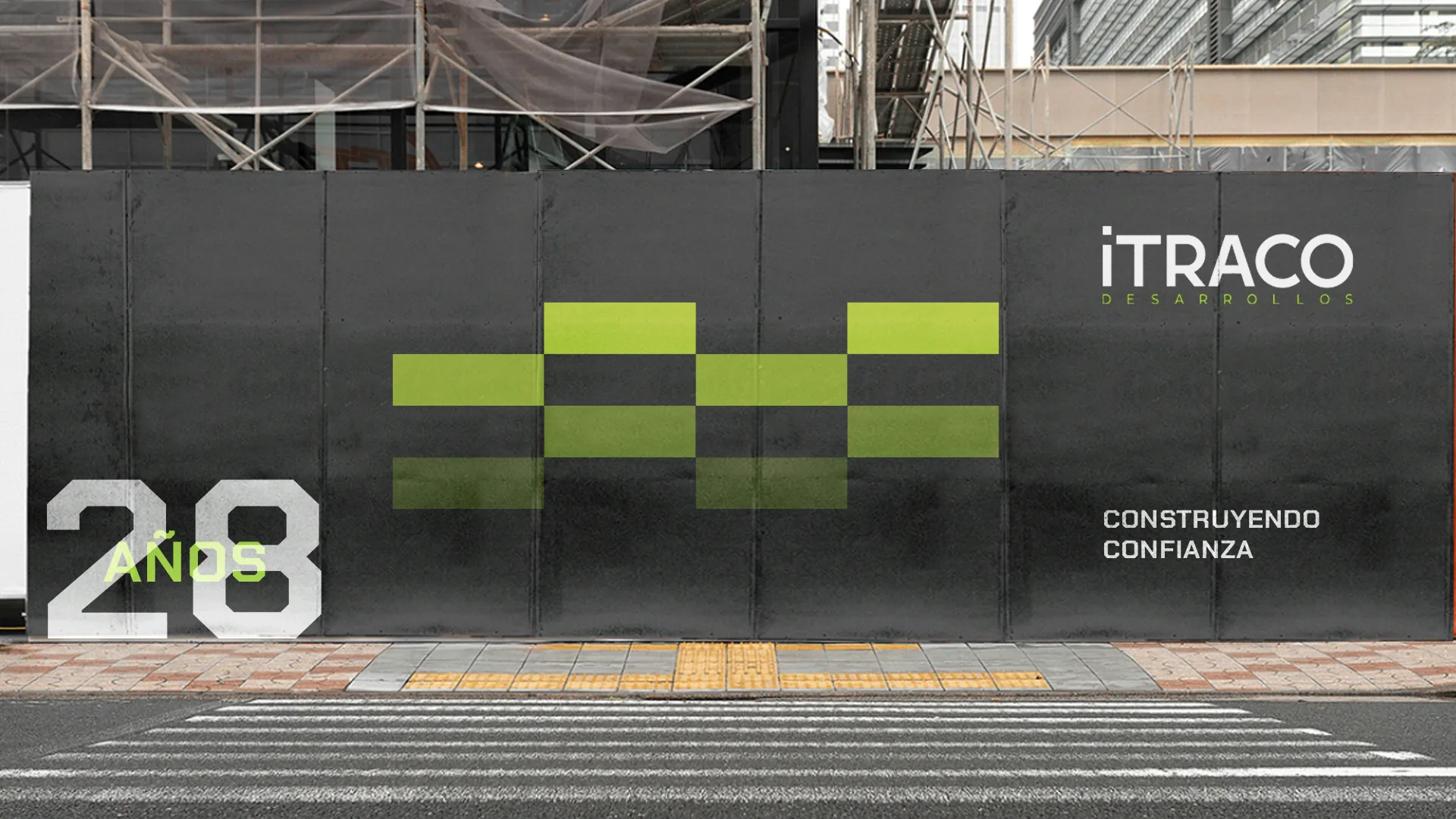
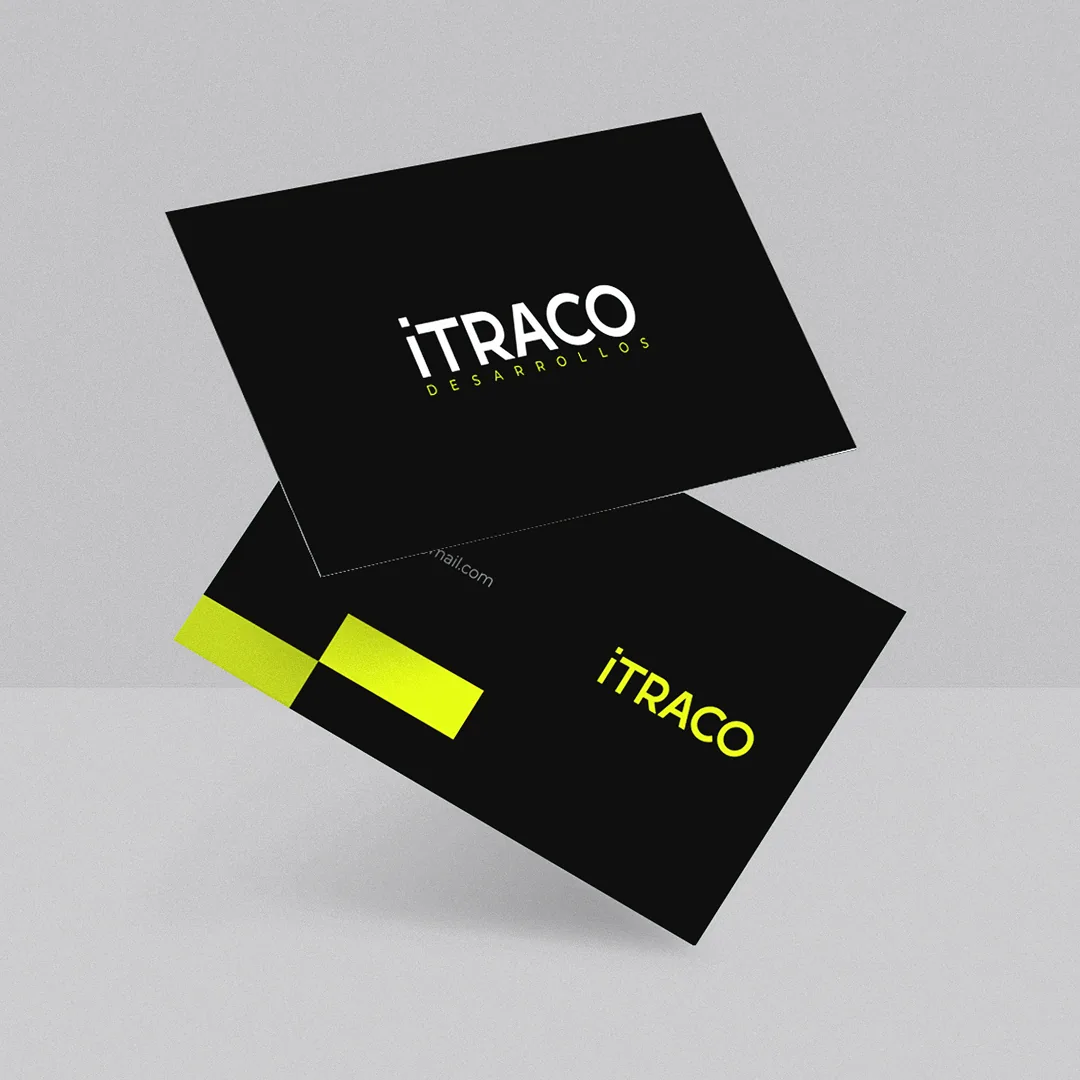
Itraco is a family real estate developer with 28 years of work behind it and, until this project, no visual identity at all. It stands for reliability, commitment and transparency, and wants people to feel calm when they invest.
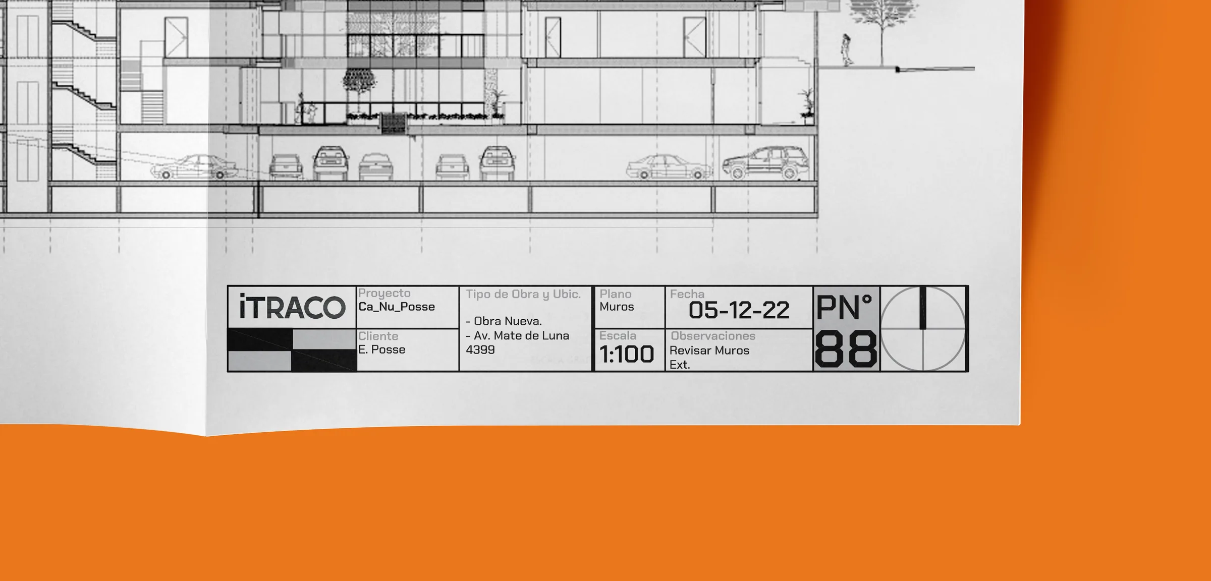
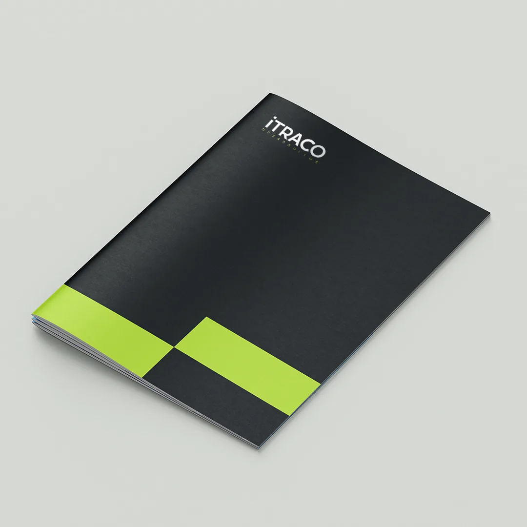
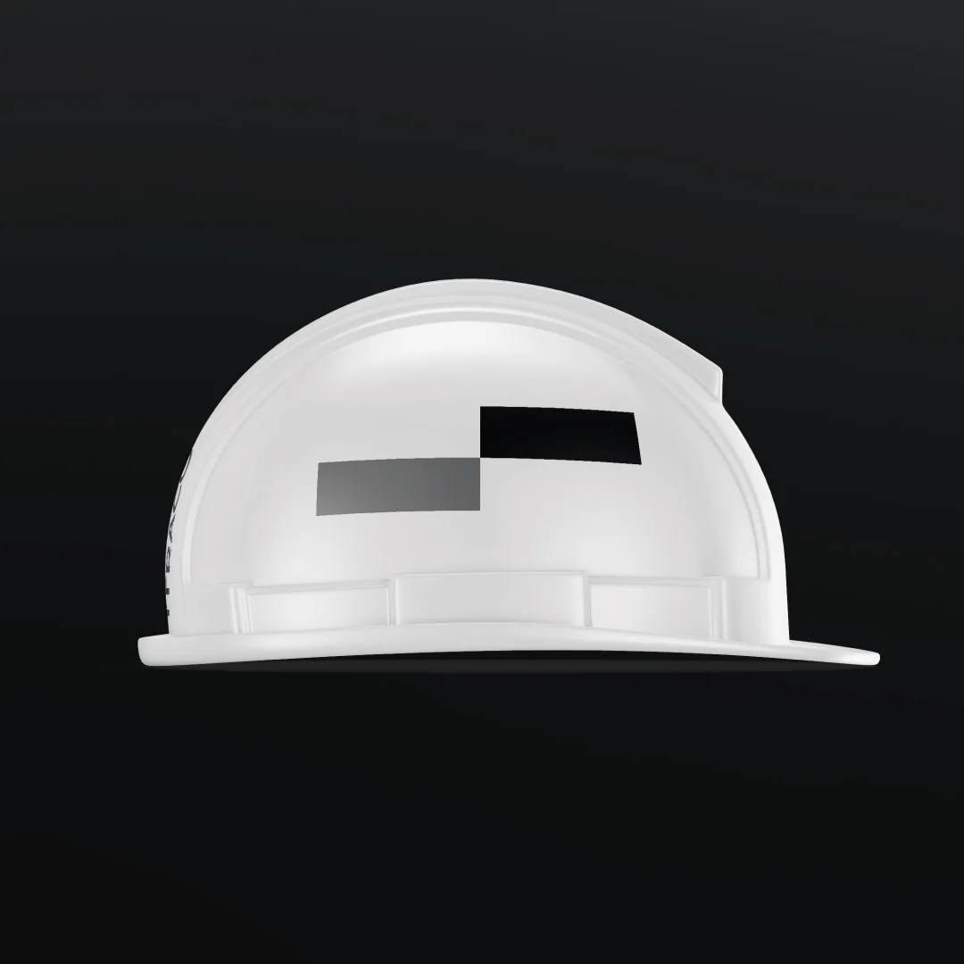
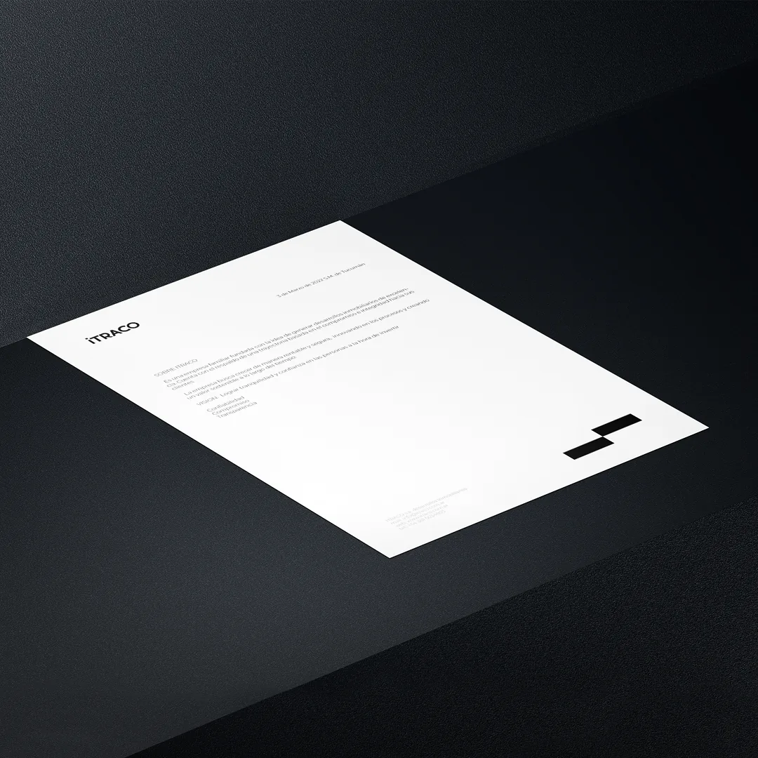
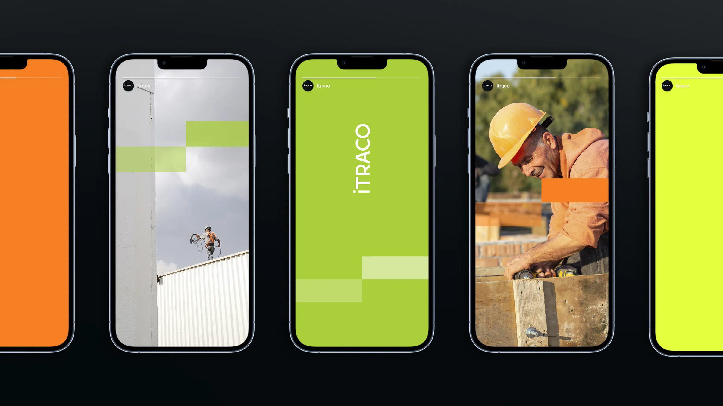
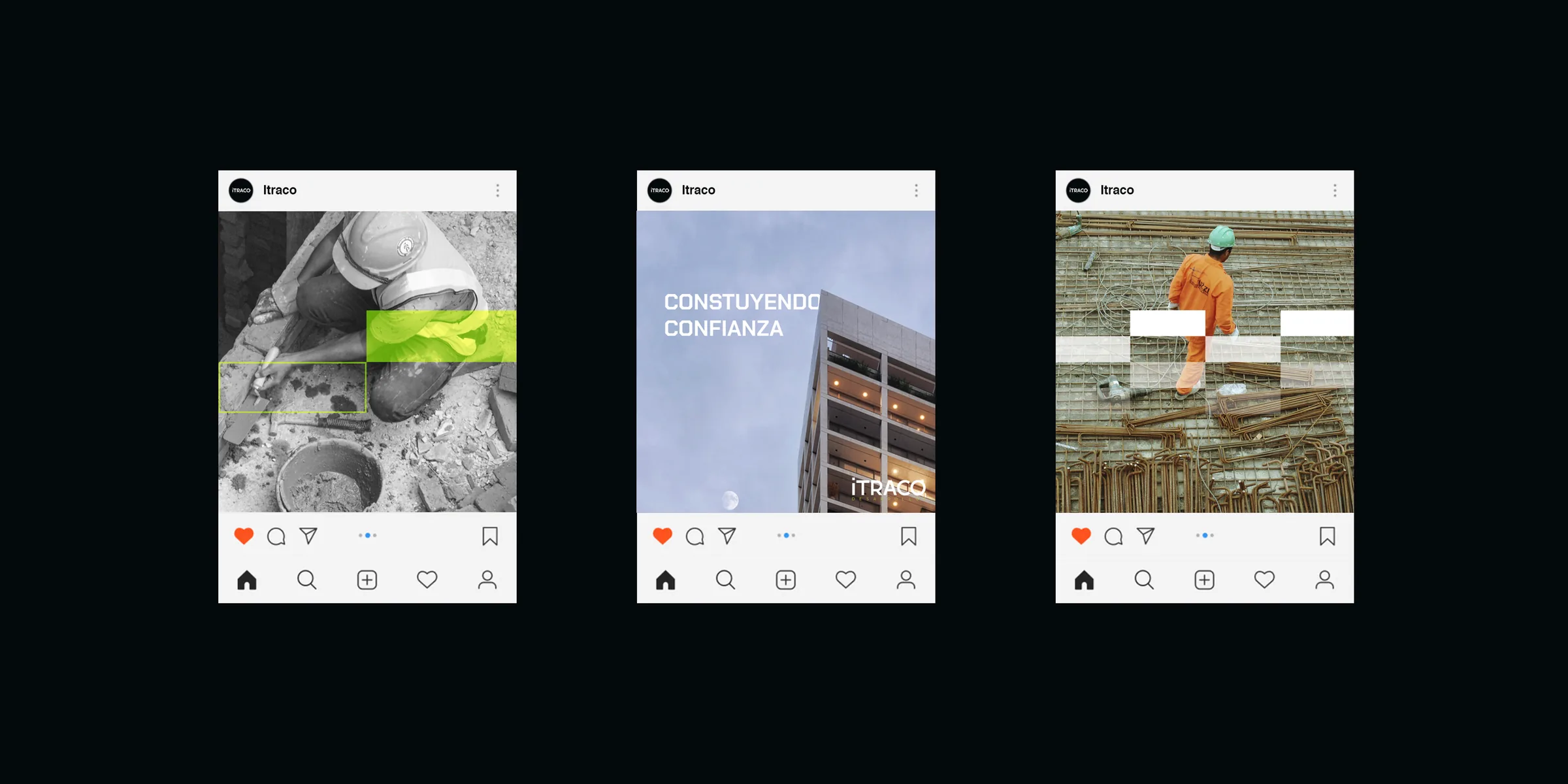
The answer came from the trade itself. The block, the basic unit of any building, became the basic unit of the brand: simple, bold and rarely seen in a sector that tends to look the same. An identity that grows the way Itraco does, one piece on top of another.